Zalo
Messaging App Redesign
Redesigning Vietnam's leading messaging app to improve navigation clarity while preserving the behaviors its users already rely on.
Role
Product Design, Design System
Year
2025
Tools
Figma, Prototyping
Type
Self-initiated concept
Project info
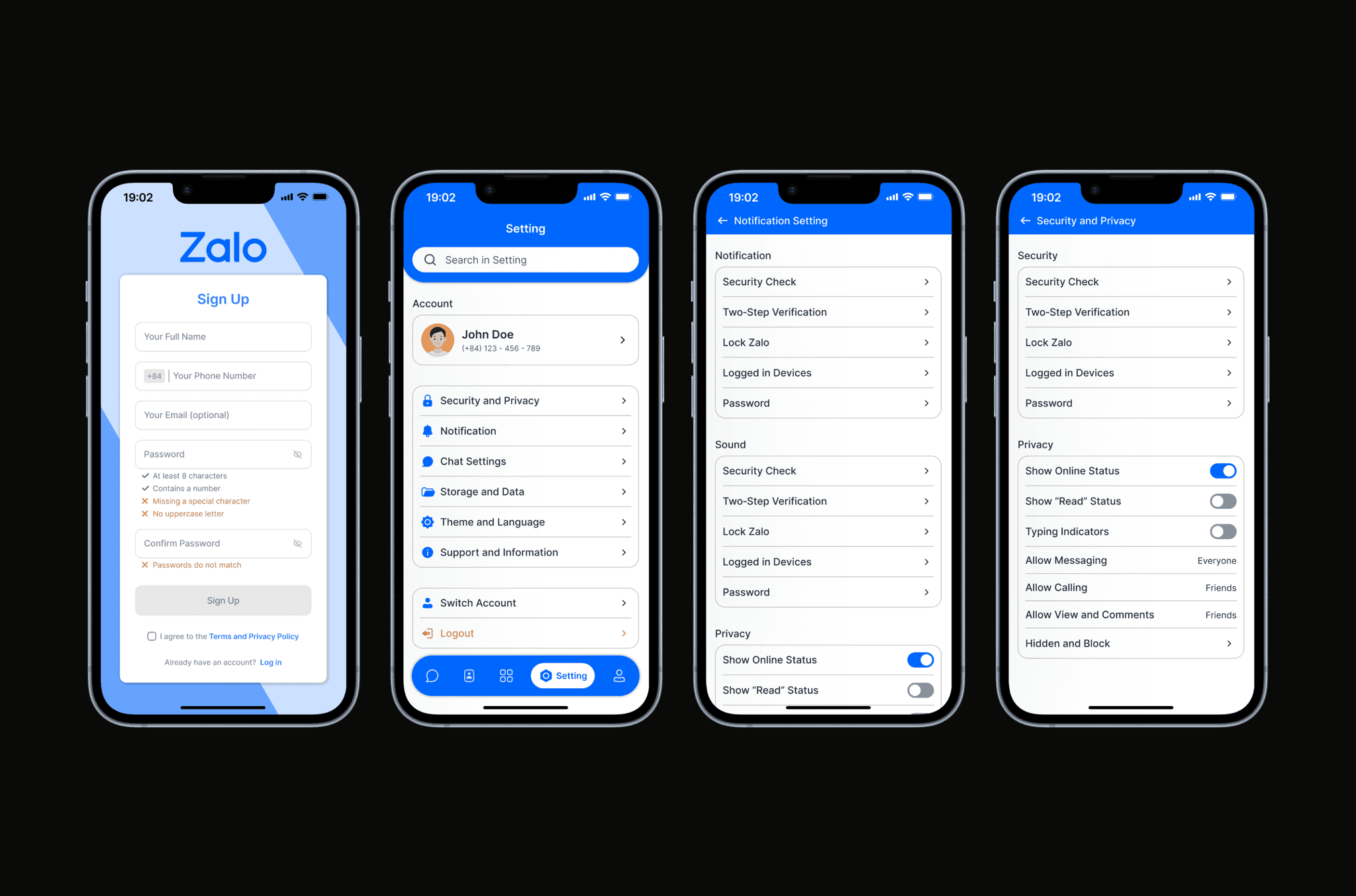
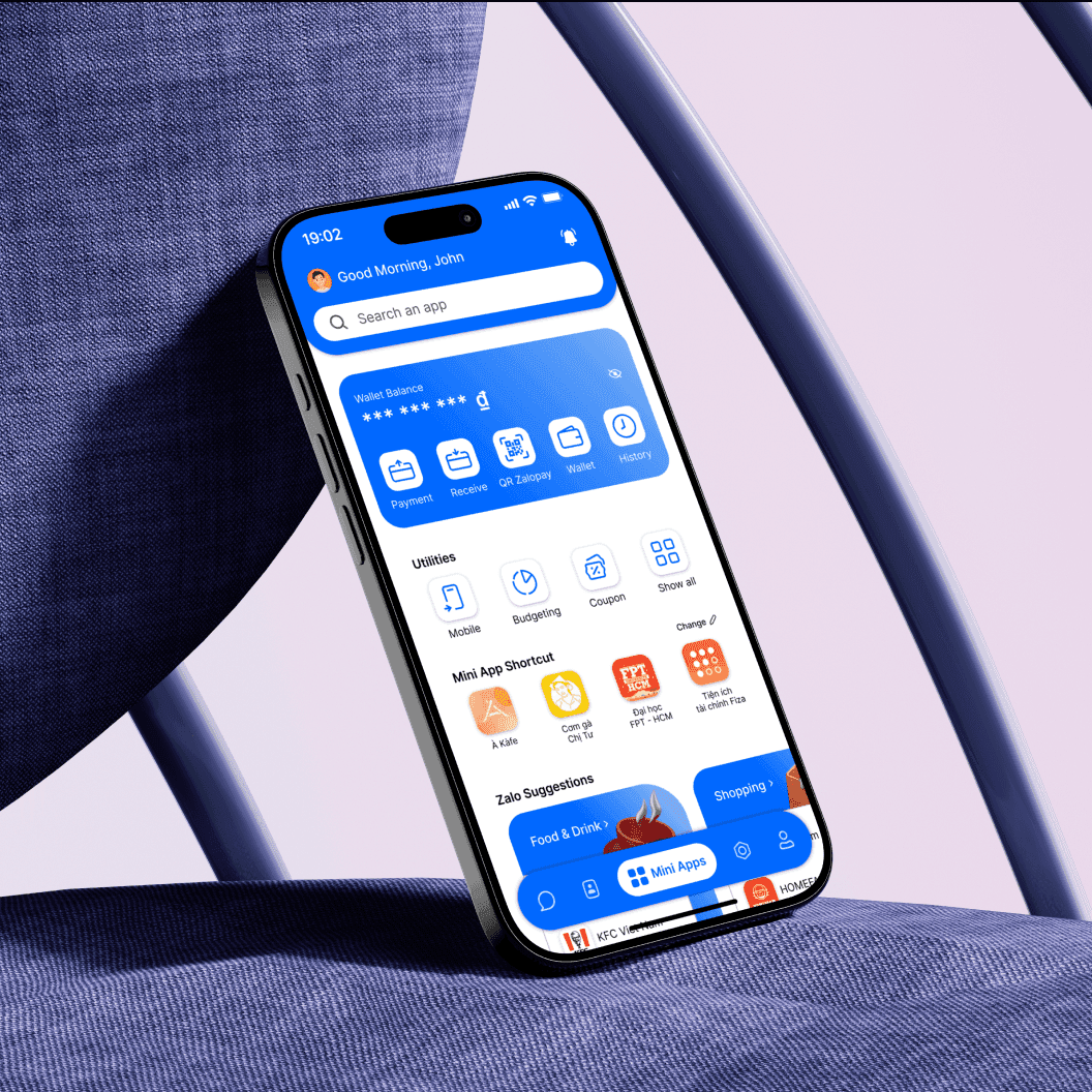
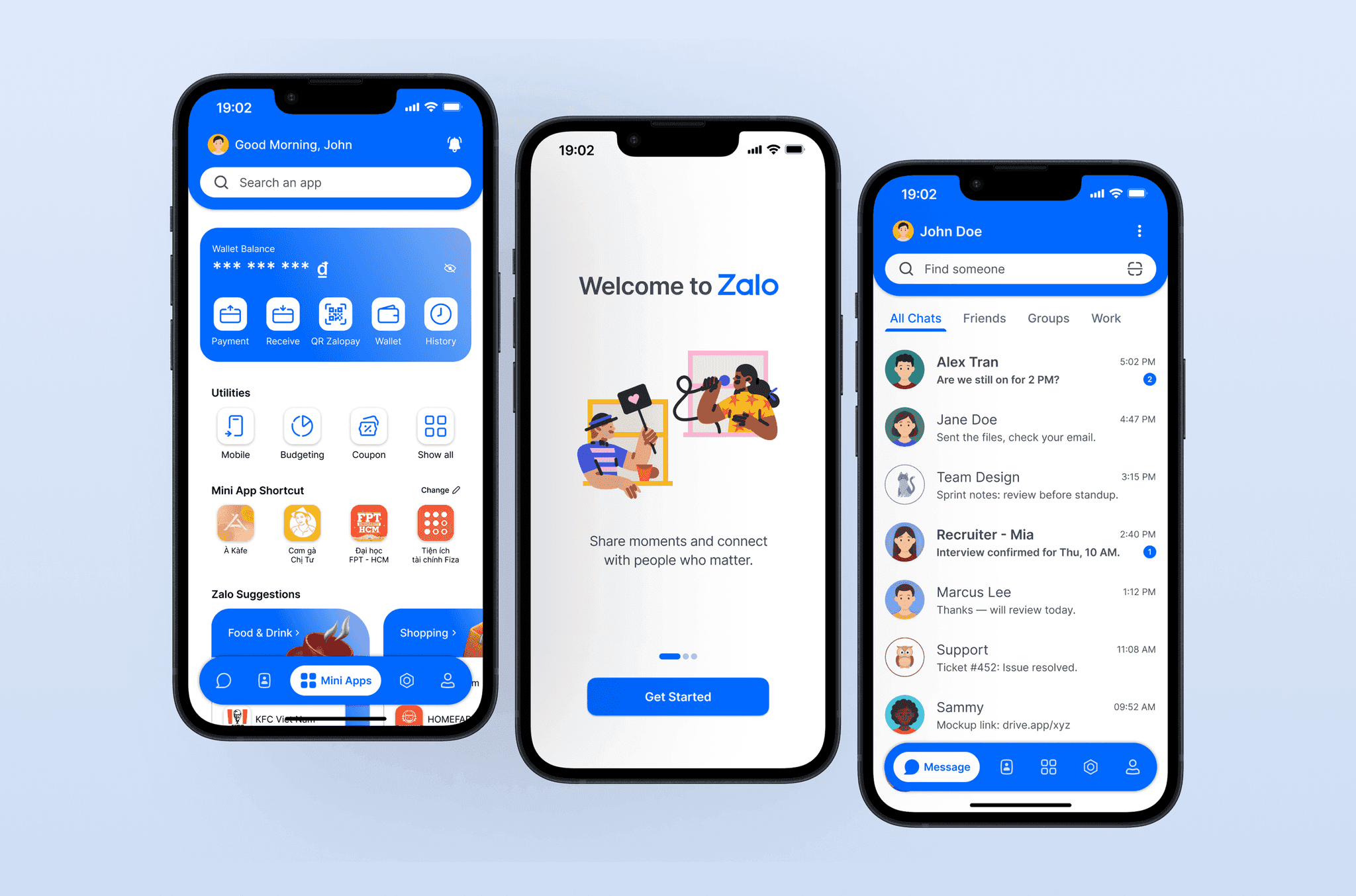
Zalo Redesigned is a concept redesign of Vietnam's leading messaging app, created to address common usability issues caused by cluttered layouts, inconsistent hierarchy, and difficult-to-find actions. The goal of the project was to reimagine Zalo as a cleaner, more intuitive communication product while still supporting the broader ecosystem of tools and services users rely on in everyday use.
Wireframe & Prototype
The wireframing phase focused on simplifying navigation and restructuring the app around clearer user priorities. Early explorations were used to test screen hierarchy, feature grouping, and interaction flow across messaging, contacts, profile, and ecosystem-related features. The objective was to reduce friction in common tasks while making the overall experience easier to understand and navigate.
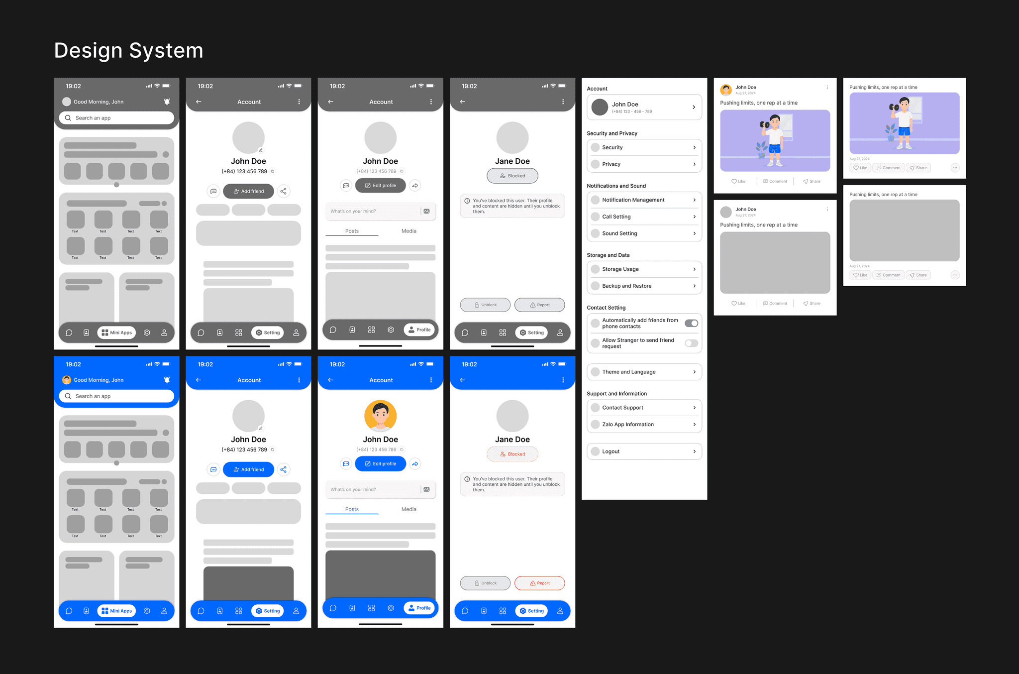
Restructuring navigation around what users actually do most, before styling anything.
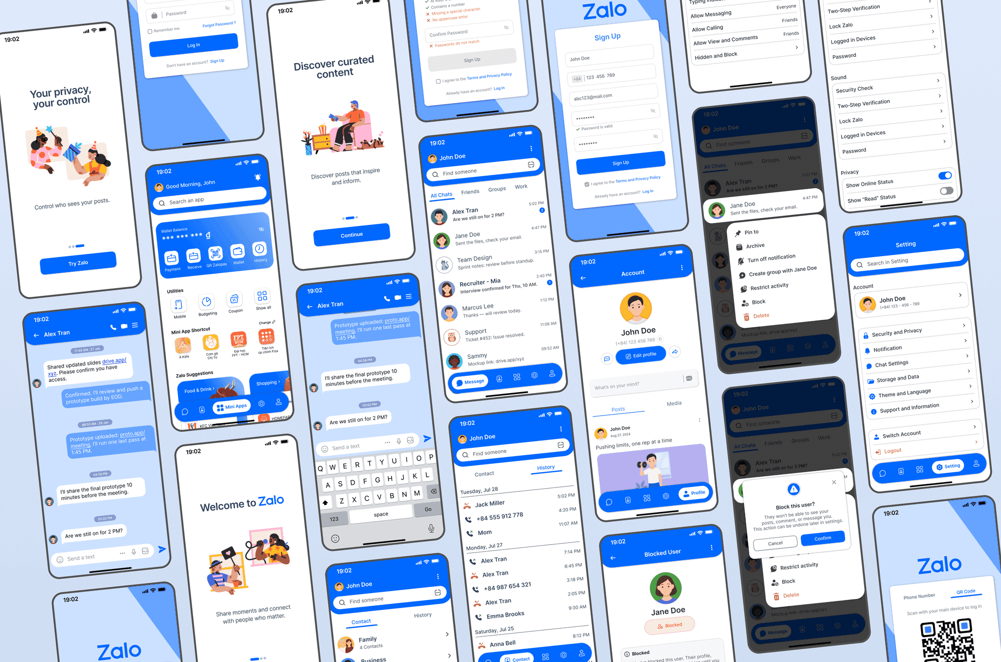
End-to-end flow map across onboarding, messaging, contacts, and integrated services.
Design System Library
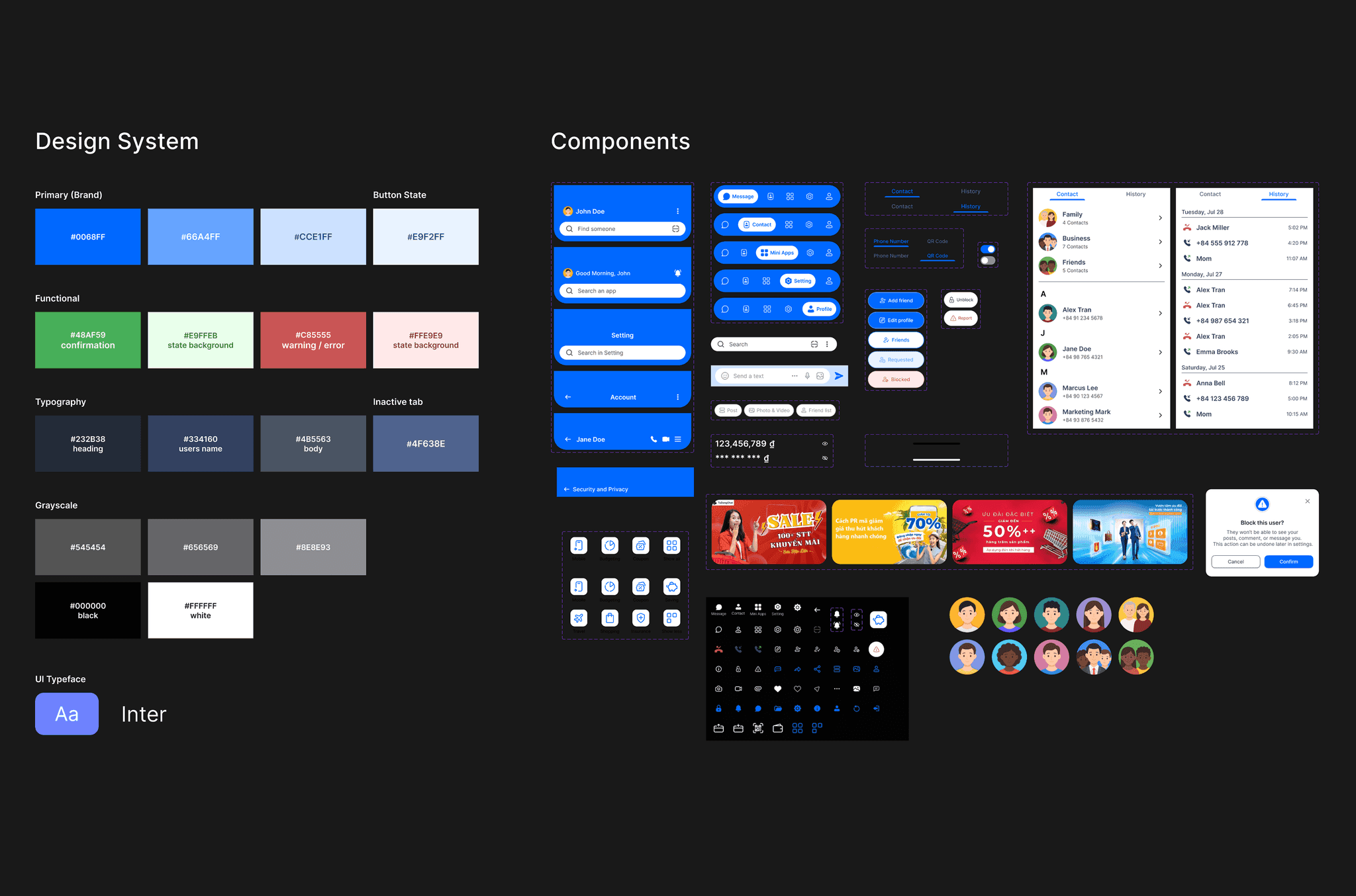
A lightweight visual system was developed to create a more cohesive and modern interface across the redesigned product. This included reusable foundations such as typography, spacing, color, iconography, cards, and navigation patterns. The system helped maintain consistency across messaging, contacts, utilities, and account-related screens while keeping the interface visually cleaner and easier to scan.
Final Scope
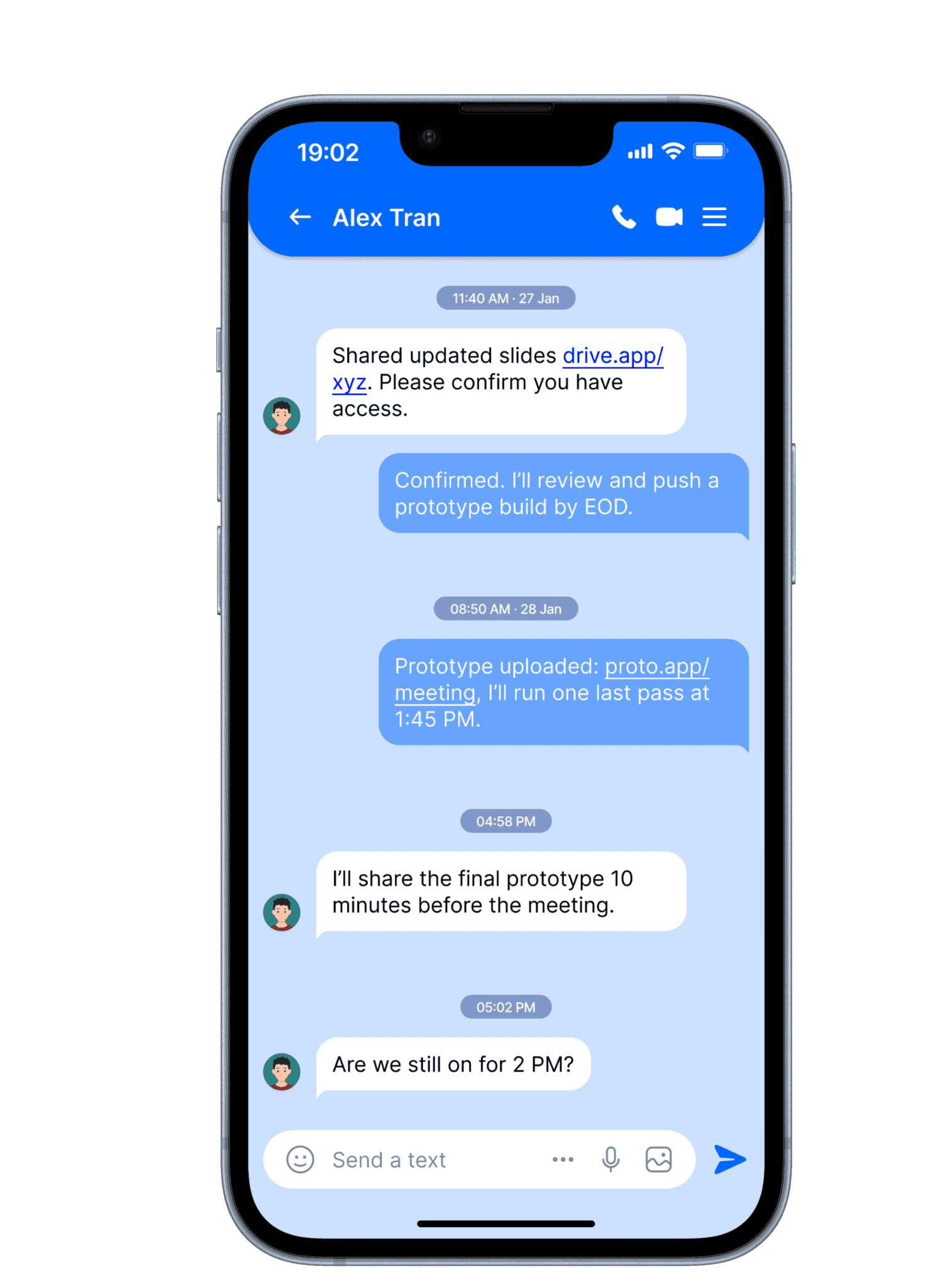
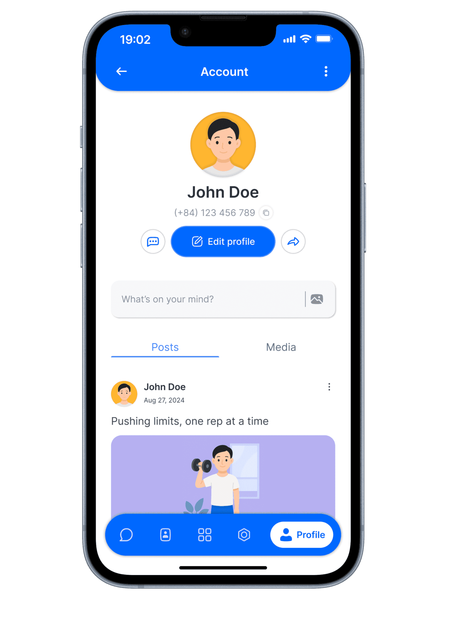
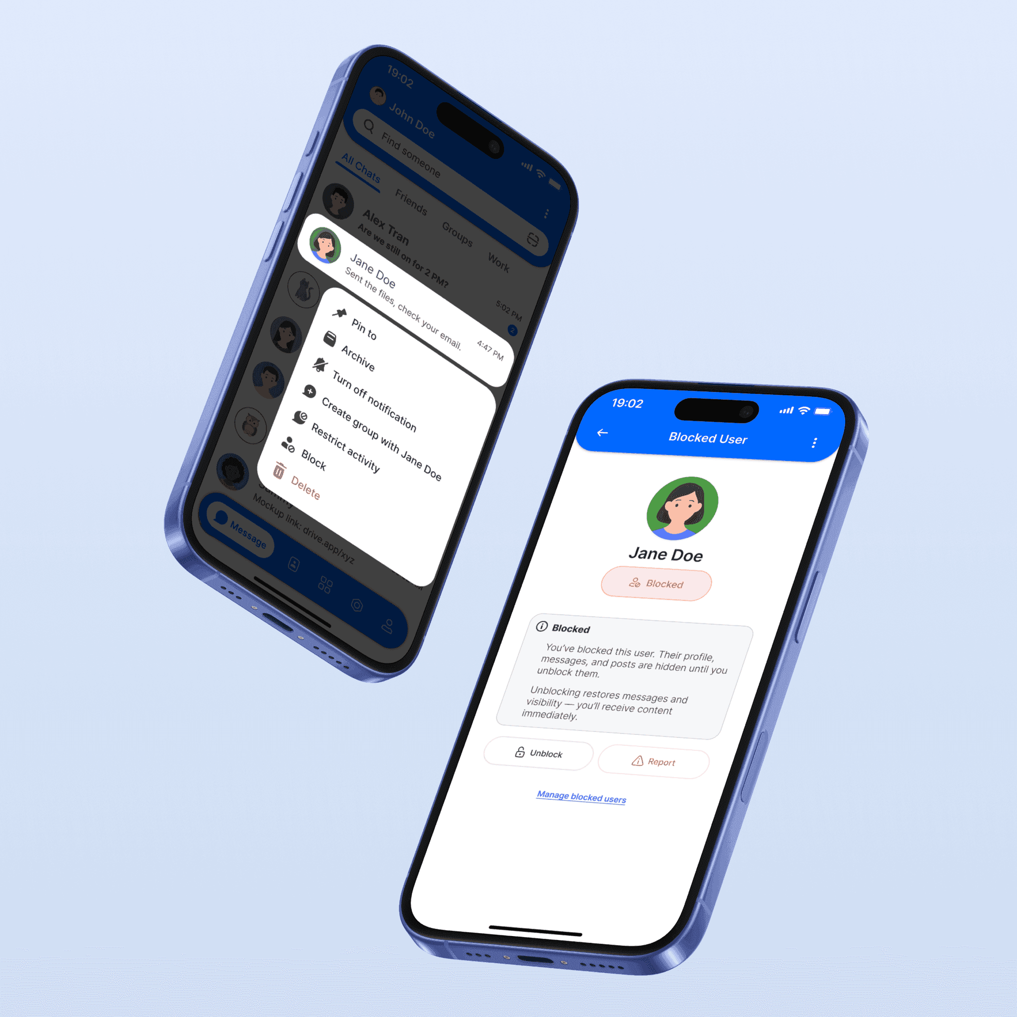
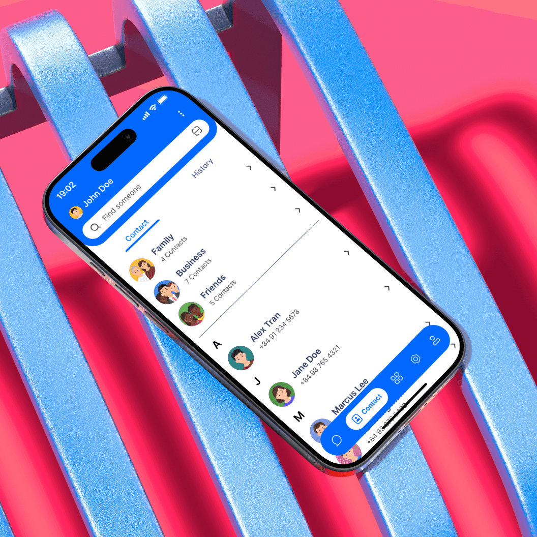
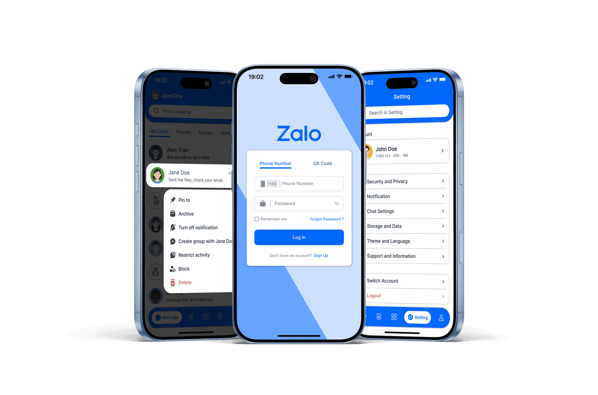
The final redesign focuses on improving the everyday Zalo experience through clearer layouts, stronger visual hierarchy, and more accessible core actions. Key screens were refined across onboarding, messaging, contact management, settings, and integrated services to create a more intuitive and streamlined product. The result is a concept that feels more modern, easier to use, and better aligned with how users interact with a multi-purpose communication app today.